ADM Design System
Auditing, documenting and implementing a consistent design system.
Background
As the Amplify Desmos Math (ADM) K-5 digital lesson suite grew in scale, so did the need for a shared design language.  A partial system existed, but it was inconsistent, outdated, and not serving the team well.  This left designers and developers to make their own interpretations, which created drift across lessons and grade bands.  The goal was to build a design system from the ground up to bring consistency across the student experience, streamline production, and give every contributor (designers, developers, curriculum specialists, and product) a shared reference we could actually use.When Amplify Desmos Math (ADM) was in early development, the digital student experience lacked dedicated design oversight. Curriculum and product teams were making UX decisions without a designer at the table, which led to friction later in the build process when interaction gaps surfaced too late to address efficiently.
Challenge
Without a reliable, shared system, maintaining consistency across an entire K-5 lesson suite was difficult. Design decisions were being made in isolation, components varied across grade bands, and there was no single source of truth for how the digital experience should look, feel, or behave.
Solution
A comprehensive design system built specifically for the ADM Digital Flex Lessons, which included components, interaction patterns, grade-band variances, and accessibility standards.
Design Process
Planning
Auditing and Compiling Existing Components
Before building anything new, I started by taking stock of what already existed. I conducted a full audit of components across the lesson library.  I cataloged what was being used, identified inconsistencies, and flagged gaps where components were missing or being improvised. This gave the team a clear picture of where we were starting from and what needed to be standardized, consolidated, or created from scratch.
Decision Mapping
With the audit complete, I mapped out the key decisions that needed to be made before any asset creation could begin.  This included things like how to handle grade-band variances, how tightly to constrain component usage, and how to balance flexibility with consistency. This step was critical for aligning the team before work progressed, so the system reflected shared decisions rather than individual preferences.
Establishing Best Practices and General Guidance
With the pre-existing assets identified, I collaborated with the design team to established a set of foundational guidelines, which covered accessibility standards, interaction patterns, visual hierarchy, and usage principles. These weren't just rules for designers but were the rationale behind every decision in the system and were written in a way that made sense to developers, curriculum specialists, and product partners.
Asset creation
Matching the Current Design System
As we continued to build out digital lessons, new components were created to serve specific learning goals and interactions.  I ensured that these new assets aligned with the now established design system.  I ensured that any new components were sustainable and reusable across various lessons and grade-bands.  This meant working within established color, typography, and interaction standards while extending them where the each digital experience had unique needs.
Considering Grade-Band Variances
One of the more nuanced challenges was accounting for the differences across K-5 grade bands. Younger students needed simpler, more visual interactions with larger touch targets and minimal text dependence.  Older students could handle more complexity.  The system needed to flex across those needs without fracturing into disconnected experiences.  As a result, components were designed with grade-appropriate variants that maintained a consistent underlying structure.
Documentation
A design system is only as useful as its documentation. In collaboration with the design team, we created a comprehensive handbook that housed everything a contributor would need.  This included design guidance, best practices, use cases, accessibility standards, and component specs.  Critically, it wasn't written for one audience.  Designers got the detail they needed to apply components correctly. Developers got the specs and interaction logic to build them accurately.  Curriculum specialists and product partners got enough context to understand the system's intent and make informed decisions within it.  Having one shared resource meant fewer misinterpretations, fewer back-and-forth questions, and a faster path from design to build.
Implementation
Streamlining the Process
I worked closely with developers to integrate the system into our existing workflows. This created a default starting point for every new lesson rather than an optional design considerations.  As a result, we saw a reduced the time spent on repetitive design decisions, cut down on inconsistencies caught late in QA, and made onboarding new team members significantly faster.  With a reliable system in place, the team could move with more confidence and spend less time re-solving problems that had already been solved.
Design system in action
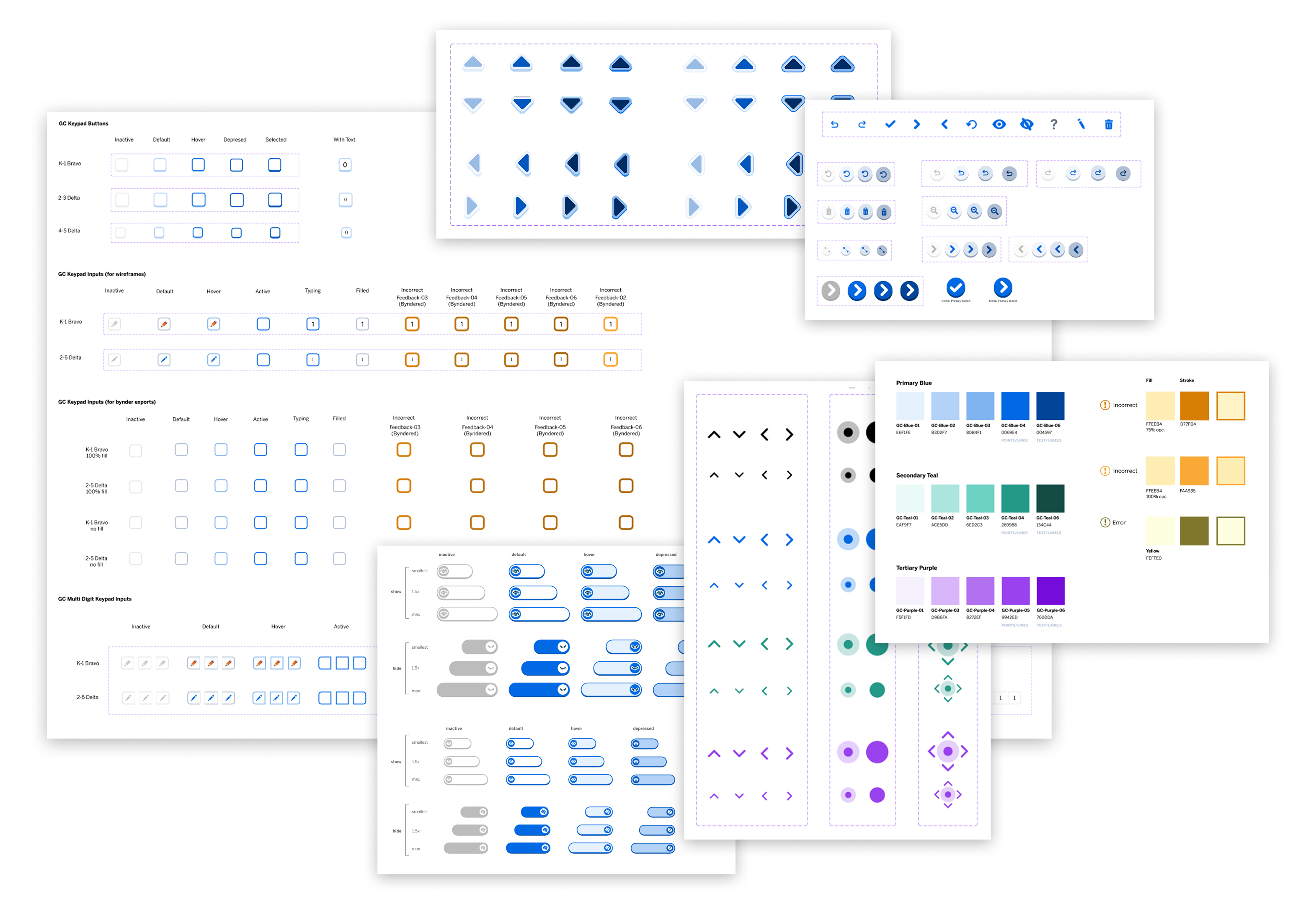
As shown throughout the design system, components vary slightly in style across grade bands.  Lower-grade components use a skeuomorphic style to help guide younger students toward clickable elements, while upper-grade components are flatter and more age-appropriate.  Both styles align with our broader platform's visual specs (as seen in page arrows and other top navigation buttons), which keeps lessons cohesive across grade levels while staying consistent with the platform as a whole.
Lower grade example
Upper grade example
When needed, components from the design system were adapted to fit specific lesson requirements.  In the first example, a draggable point helps students plot a number on a number line.  Since precision wasn't critical for this estimation-based lesson, we kept the component's standard accessible size and styling.  In the second example, students are asked to plot a number to the thousandths place. Unfortuantly, plotting to the thousandths place required more precision than the standard draggable point could offer.  To address this while staying true to the design system and accessibility standards, we paired the draggable component with a smaller point to allow for more precise placement.
Estimation on a number line
Precision on a number line
Throughout production, some lessons required specialized assets to fully meet their mathematical goals. For these, I created custom components, while keeping them consistent with the styling patterns established in the design system.
Clickable name card and block assets
Individual coin assets (head and tails)
When choosing components for each interaction, grade-level appropriateness was a key consideration.  In the first example, a lower-grade lesson asks students to split a shape.  Our user research showed that younger students often struggle with draggable interactions, especially on trackpads. To account for this, I opted for a simple click interaction instead of a draggable point.  However for mid to upper grade interactions (as seen in the second example), we kept to the standard draggable interaction for manipulating and splitting shapes.
Lower grade example
Upper grade example
Key Learnings
A design system should evolve alongside the product
Building a system means establishing consistency, but maintaining it means recognizing when the system needs to grow.  We had clear component behavior rules around things like how screens reset, when to persist feedback, and when to clear student work. Those rules worked well for straightforward interactions.  But as lessons grew more complex, we occasionally encountered interaction patterns the system didn't yet account for.  Rather than forcing a lesson into an ill-fitting pattern or abandoning the system altogether, the answer was to treat those moments as signals. We identifyed gaps, developed new solutions that felt cohesive with the existing system, and folded them back in as the system matured.  A well-maintained design system isn't static, instead it grows with the product it serves.
Documentation is a design problem too
Writing a handbook for four different audiences (designers, developers, curriculum specialists, and product) meant that clarity and structure weren't optional. The same way a poorly designed interface creates confusion, poorly written documentation creates misinterpretation.  Thinking about the handbook as a UX problem, with distinct user needs for each audience, made the end result significantly more useful and easier to adopt across the team.