Amplify Desmos Math
Designing an engaging and digitally-accessible student experience.
Challenge
When Amplify Desmos Math (ADM) was in early development, the digital student experience lacked dedicated design oversight. Curriculum and product teams were making UX decisions without a designer at the table — leading to friction later in the build process when interaction gaps surfaced too late to address efficiently.

The challenge was twofold: establish a scalable, accessible design process for a technically constrained platform, and deliver an engaging student experience that met rigorous state adoption standards across K–5 grade levels.
Solution
To meet that challenge, we re-built a cross-functional, agile design process that brought together curriculum specialists, product managers, developers, and researchers at every stage. By embedding design into conversations that previously had no design presence, establishing a consistent design system across the full K–5 grade band, and holding accessibility as a non-negotiable throughout, we were able to deliver a cohesive, polished and innovative digital experience.
Background
Amplify Desmos Math is a K–5 math program built around problem-based learning, which pairs teacher-led instruction with interactive, student-led digital experiences.  My work centered on the Digital Flex Lessons, the student-facing digital experience, where abstract math concepts come to life through hands-on interactions built inside the Desmos Graphing Calculator.  Our lesson development followed an agile, cross-functional workflow across five phases: concepting, ideating, refining, building, and QA.  
My Role
I served as lead designer for the K–5 digital student experience, owning design from early conception through final QA and post-launch iteration:
Design Process
Concepting
content Mapping
Before any interaction was designed, I partnered closely with curriculum specialists to understand the mathematical learning goals for each unit. I applied systems thinking to map learning progressions across grade levels. This informed our decisions around lesson flow, scaffolding, and interaction opportunities.  Together, we identified which lessons would benefit most from a digital experience.
Key design contribution: Concepting was initially a product and curriculum-led stage with no design involvement. Without UX considered early, teams frequently hit roadblocks during the build phase.  For example, interactions were difficult to implement or didn't serve student needs.  I made the case for embedding design into these early conversations, which streamlined later stages, reduced rework, and kept production moving efficiently. This shift became a standard part of our process.
Ideating
Finding a Problem-Based Approach
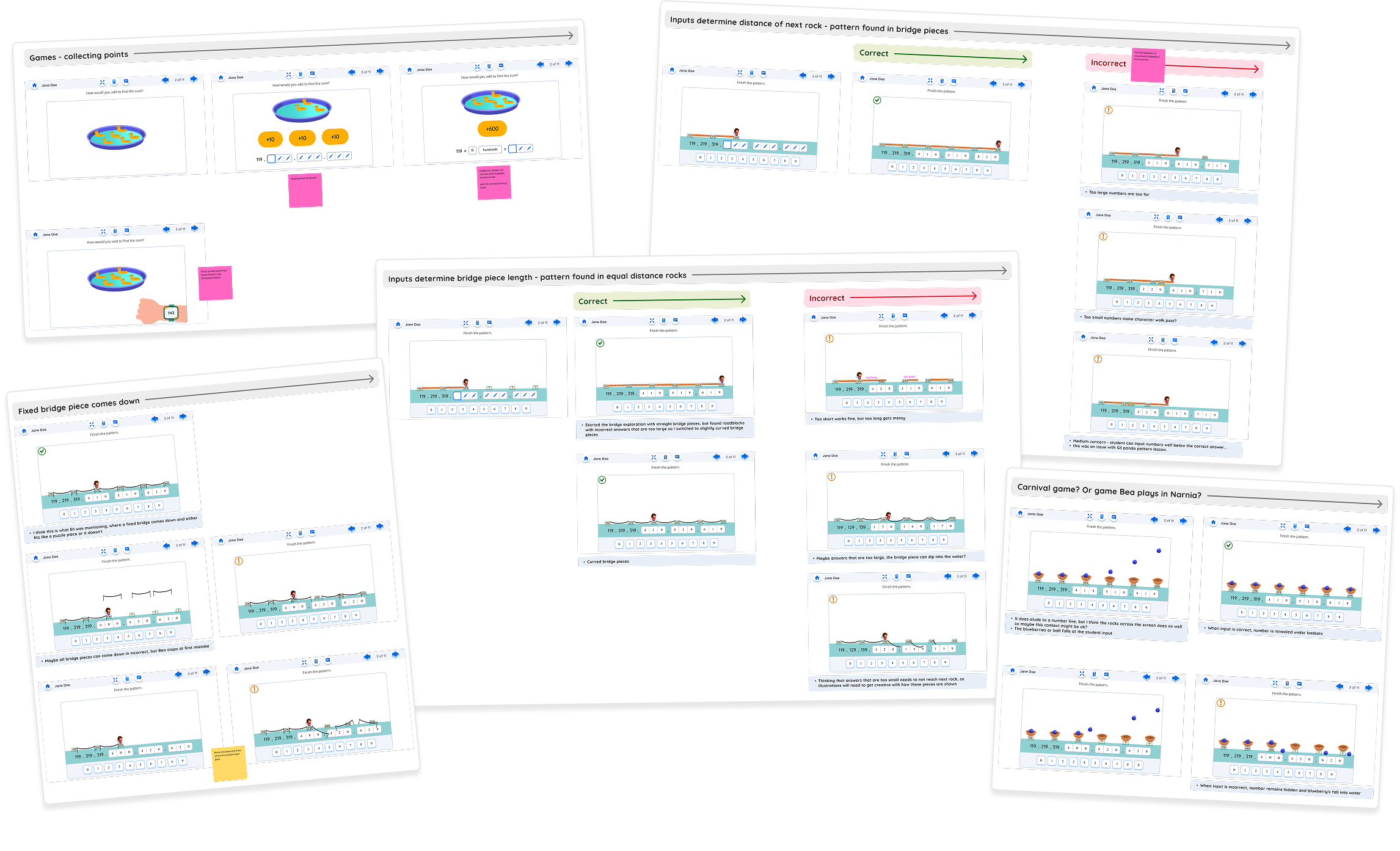
We moved into the ideation phase after a core mathematical concept was chosen.  We began exploring lesson context and problem-based learning opportunities.  I quickly translated these ideas into low-fidelity wireframes and interaction concepts, which helped the team visualize possibilities, align on a direction and make informed decisions.  This rapid iteration approach allowed us to stay agile, reduce ambiguity and maintain tight production timelines.
Refining
Sweating the details
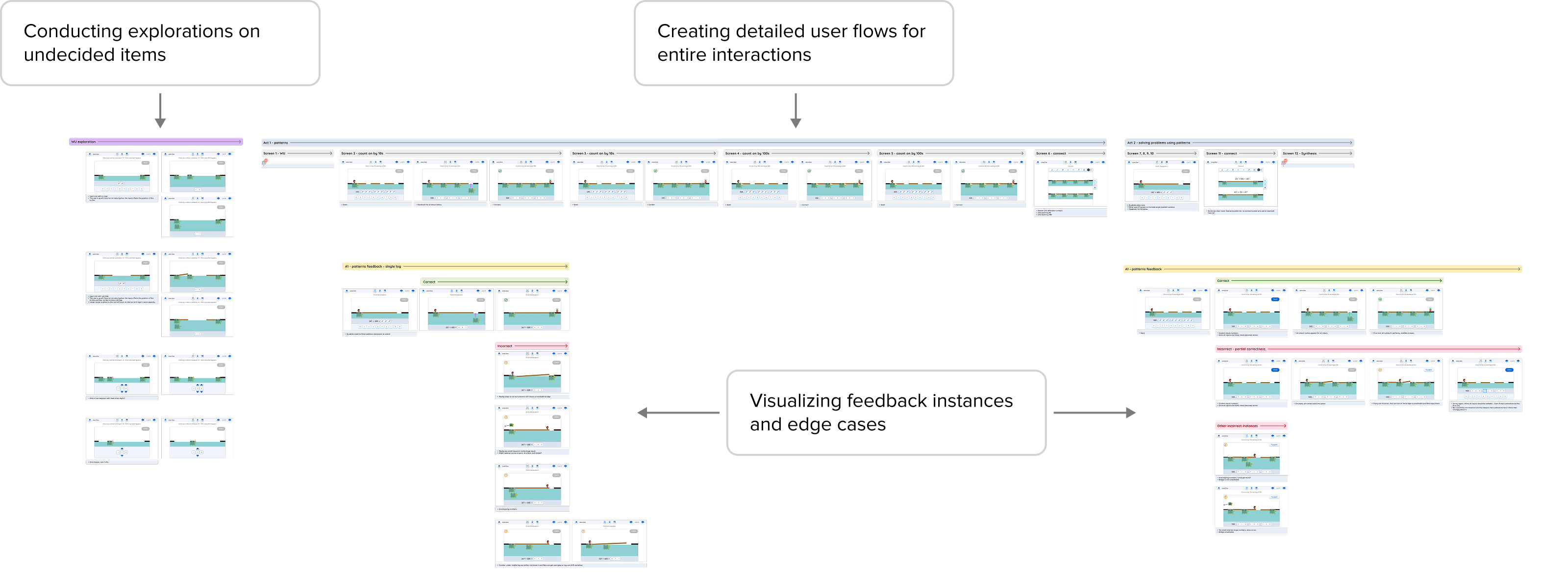
With a lesson direction established, we moved into refining.  Here we decided on the details that truly impacted the student experience.  This included the full interaction flow, feedback states, screen end states, error handling, and moments of user delight.  I held accessibility and usability as non-negotiables at this stage, consistently pressure-testing decisions against WCAG standards and asking how each interaction would feel for a student with a visual impairment, motor difficulty, or learning difference.  For more complex interactions, I worked directly with developers to validate technical feasibility before designs were finalized which helped avoid unexpected pivots during the build phase.
Building
With refined designs handed off, developers began building interactions inside the Desmos Graphing Calculator, a highly unique and constrained environment where all student-facing interactions live.  I stayed closely involved throughout this phase, conducting regular check-ins to ensure implementation matched design intent.  I flagged inconsistencies in styling, interaction behavior, and accessibility compliance before they compounded, which kept quality high without slowing the team down.
QA
The final stage brought together stakeholders from across the organization for a structured review before launch.  I conducted a final design review at this stage where I checked for accessibility compliance, visual consistency and any outstanding issues flagged during development.  I also served as the point person for cross-functional feedback coming in during this window, triaging, prioritizing, and routing issues so nothing fell through the cracks.
Future Opportunities & Key Learnings
Post-Launch Feedback
After completing the full K–5 digital lesson suite, we moved into a beta revision phase.  I collected data from early users and iterated based on what we learned.  Once the product fully launched, my focus shifted to ongoing maintenance and experience improvement.
I established a process for collecting and organizing user feedback as it came in, triaging critical issues for immediate resolution and tracking recurring themes over time. When patterns emerged, I synthesized the feedback into structured improvement pitches and presented them to the suite team, making the case for prioritization alongside leadership and cross-functional partners.  From there, we collaborated to explore solutions, mock up new iterations, and assess the scope and impact of each change.
Learning and Insights
Early design input changes everything.  Getting into the room during concepting, before directions were set and decisions were made, had a compounding effect on every phase that followed.  When UX was considered from the start, curriculum goals and interaction design aligned more naturally, rework during the build phase decreased, and production timelines stayed on track. The earlier design has a seat at the table, the less it has to fight for one later.

Accessibility and usability look different depending on who you're designing for.  Although both experiences focused on creating intuitive interactions that met WCAG standards, the student and teacher experiences required fundamentally different approaches. For students, the focus was on clarity, cognitive load, and ensuring every interaction was easy to navigate across all common student devices. For teachers, the priorities shifted toward efficiency, scannability, and how well the experience held up when projected in front of a live classroom. Recognizing those distinct needs early shaped how we approached each experience separately rather than applying a one-size-fits-all standard.

Constraints can sharpen your thinking.  Building every interaction inside the Desmos Graphing Calculator was a real limitation, but it also forced a level of design intentionality that looser constraints don't usually demand.  Working within a constrained platform meant every interaction had to earn its place, which ultimately led to cleaner, more focused experiences.